CONTEXT
Purrniture is, sadly, a made-up company I created for coursework at the School of Visual Concepts (but I hope somebody takes the rad name and concept to completion). For this course, we were asked to create a fake company that needed a full-cycle website. This concept would follow us through our first four classes of the UX certificate progam: user research, information architecture, interaction design, and usability testing.
I love cats, I love shopping online, and I love the ridiculous. Thus, Purrniture was born.
OVERVIEW
Purrniture is a small business that specializes in luxury cat furniture, in a variety of styles and materials, so cat owners can give their fur baby something that matches their own design aesthetic. They partner with a selection of designers for exclusive content. Each purchase is a lifelong investment, so customers can access product support, such as assembly instructions or replacement of broken or missing pieces, for an unlimited period.
Problem
Cat furniture sites tend to feature the same building materials, colors, and styles, without a lot of options for a cat owner’s personal style. In today's market, the options are to either buy something they don't find attractive, or don't buy their cat furniture. Cat owners need a place to buy furniture that they find attractive, and which fits into their design aesthetic.
MY ROLE
user research
information architecture
UX Design
UX writer
interaction design
prototype
TOOLS
Paper
Omnigraffle
Figma
Optimalsort
Google Sheets
Google Survey
Cat owners need a place to buy furniture that they find attractive, and which fits into their design aesthetic.
USERS
Purrniture’s users are cat owners, or friends of cat owners, with an elevated sense of home decor. At first users were limited to people with cats, but my initial research indicated that friends and family also like to buy these things for cat owners.
The user is comfortable enough with technology to make purchases from a desktop or mobile device, because Purrniture does not have a physical store.
Users could also be veterinary hospitals, animal shelters, and pet stores, but they were not my targets and the focus on this project. Based on informal research with a veterinary hospital, I concluded they were unlikely to use the site, due tocost of Purrniture’s products.
PROCESS
I started with the following hypotheses:
- People who own cats want to buy their cats furniture
- People who want cat furniture won’t buy it if they don’t like the way it looks
To verify or disprove my hypotheses, I came up with these research goals:
- Understand the experience of cat owners who purchase cat furniture, by doing a competitor analysis
- Understand the customer purchasing mental model— how did people approach the purchasing process?
DISCOVERY
I started with desktop competitive analysis on online stores that focus on cat products and furniture, and along the way discovered my hidden assumptions that Amazon would be in the top results, and that Amazon would be the primary place people purchased their cat furniture. Once I passed the ads, Amazon wasn’t in the top 3 results.
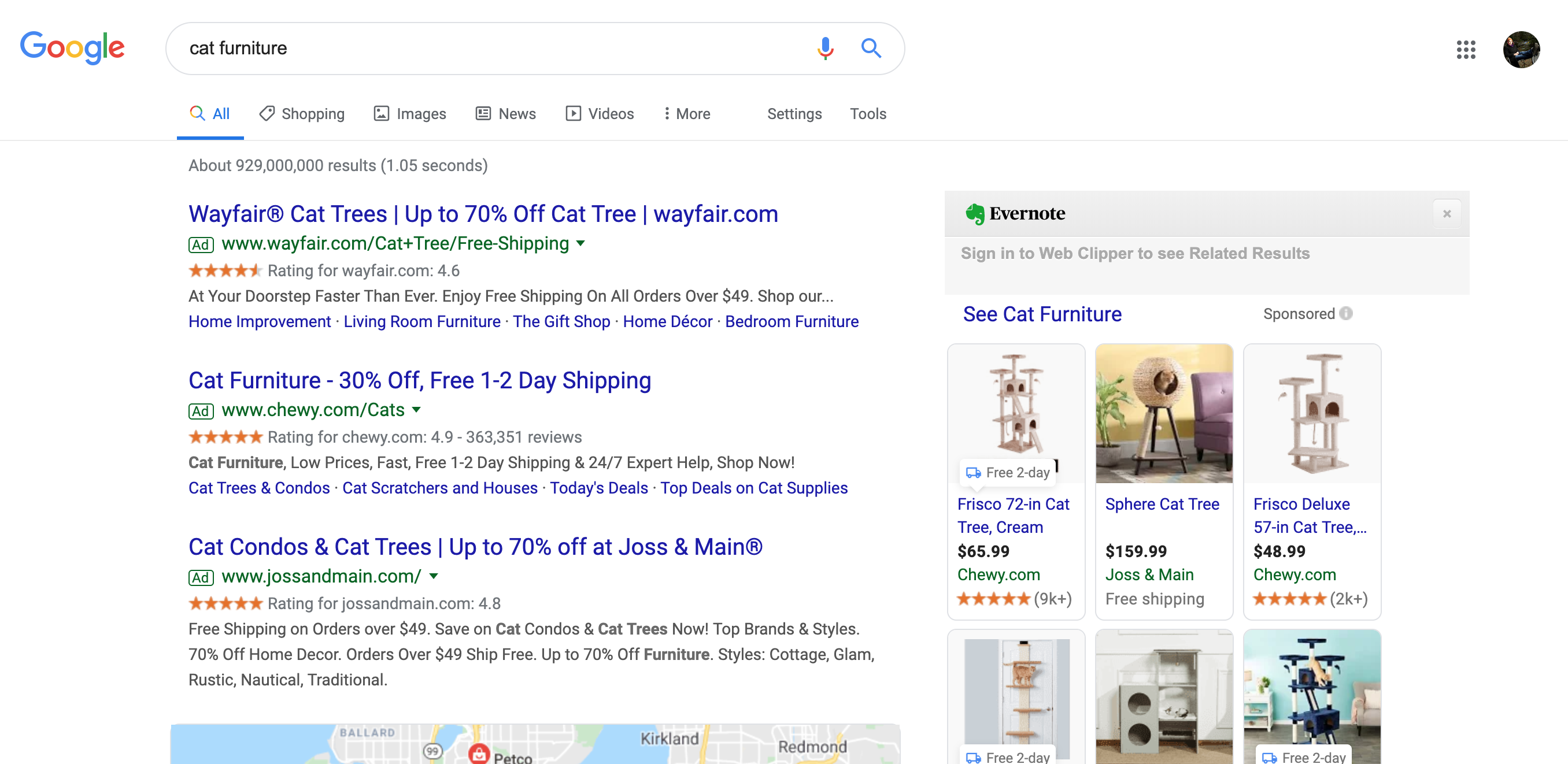
Amazon isn't anywhere to be seen.
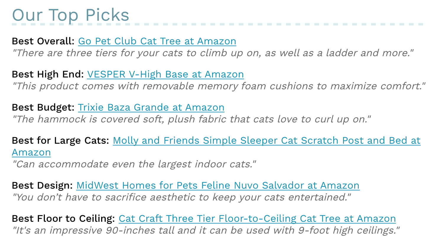
But Amazon did sell all the items listen on "best-of" lists.
To get an idea of the customer purchasing mental model and do further competitor analysis, I conducted five 1-hour interviews with cat owners, and friends of cat owners.
Here’s what the interviews told me:
- Four out of five people I spoke with did buy their pets cat furniture, and often more than one of each type.
- Most of my participants didn’t care about looks, but the ones who did care really, really cared. The people who cared about the appearance also said they didn’t find their products on popular sites like Amazon or Paws, saying these offerings were inconsistent, and finding a cat bed they liked was usually an accident.
- Despite my assumption that people who buy cat furniture buy on Amazon, not one single person I interviewed got their furniture at Amazon. They all used it for reviews, product research and browsing.
- When I asked them what they liked about browsing on Amazon, the most common answers were reviews, price comparison, and to help recognize what features they wanted.
- The most common concerns about shopping online were the following:
- Durability
- Cost
- Purchase confidence
- Convenience
Problem Re-frame
Based on the interviews, I reframed the problem to focus a site experience that prioritizes convenience, and elevates customer confidence in their purchases. This was more in line with the customer mental model. I chose not to focus on cost, even though it was a primary concern, because it's a niche product that sells at a higher price point than most pet furniture.
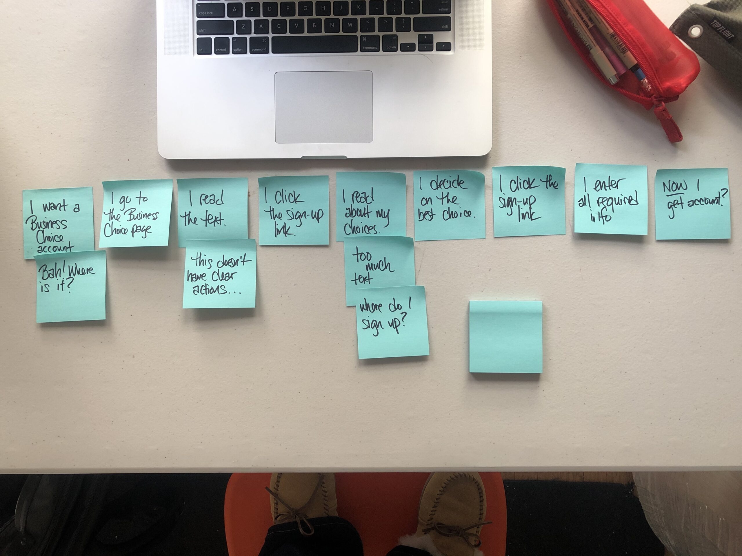
User Empathy
After all the research, I wanted to get a better understanding of my users. I read through all my interview transcripts and gleaned the following user stories and insights, to pinpoint what their needs are.
USER STORIES
- As a shopper, I want confidence that what I’m buying will last a long time, so that I can justify spending so much money.
- As a shopper, I want to read the reviews so I don’t waste my money.
- As a busy person, I want the convenience of shopping online, so I can save time.
- As a shopper, I want as much variety as possible so I can pick the options that best suit me and my pets.
I created even more user stories, but they don’t tie back to my problem. They’re available to view upon request.
USER INSIGHTS
- In case their cats destroyed toys and furniture, customers didn’t spend a lot of money, so they didn’t feel like they were wasting money.
- Unsure about the quality of cat items, customers read online reviews of more expensive items, so that they feel confident in their purchase.
- Unfamiliarity with other online retailers meant customers shopped with Amazon for cat purchases, because they felt safe purchasing products.
Competitive Benchmarking
I conducted 8 usability sessions for a competitor’s site, Chewy. The idea was to identify user pain points in navigating and completing a number of tasks, and incorporate that data into Purrniture’s design.
These sessions had three goals:
- Discover how users interact with www.chewy.com
- Identify and assess the pain points for different types of users
- Identify any obstacles to finding pet furniture
The usability sessions were all completed online on Zoom, with the participants given control of my computer while I videotaped their voice and mouse movements. For metrics, I measured time on task, success rate, and # of attempts.
These sessions identified 2 main usability themes: credibility and usefulness.
Here are the findings:
- 6 out of 8 didn’t users didn’t fully understand the sort control terminology. In one instance, they were confused by the use of “best-selling.” As a few people pointed out, a lot of factors go into a product being “best-selling”, such as cost, a promotion, quality. It placed too much on the user to figure out why an item was a best-seller. Far more useful, they felt, was language like “most reviewed,” or “best reviewed.”
- Every identified issue received a severity rating from one to four, using the Dumas Redish scale, where “1” prevents task completion and “4” causes no or minor usability issues. The only task with that prevented completion was finding the best-selling cat bed, because the photos returned were mostly dogs.
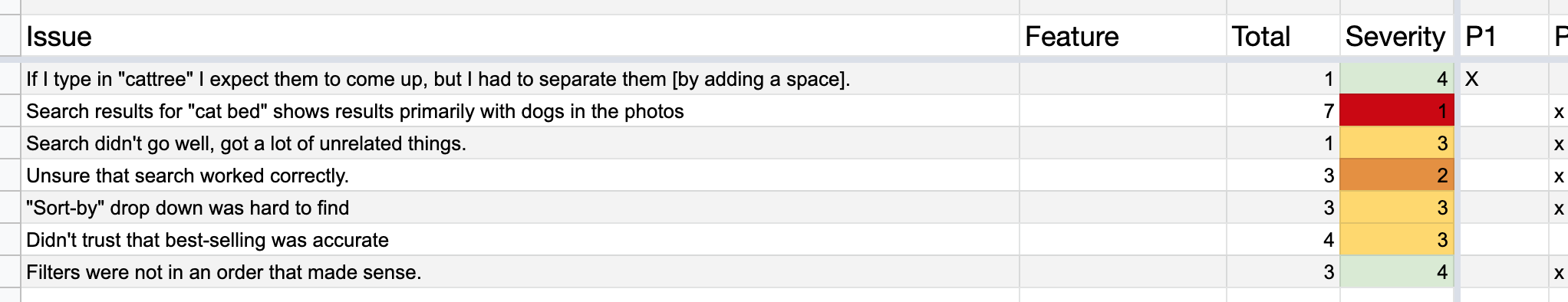
"Do I believe them? There should be a strong correlation between most reviewed and best selling, but there's not. Makes me wonder: is it broken? Should I not trust them?"
- Participant 6
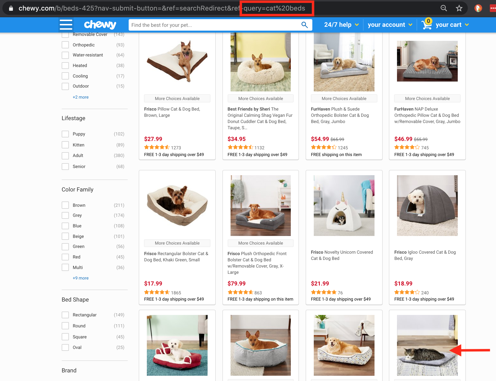
On a search for "cat beds", dogs are in the first 11 pictures.
- Photo accuracy was incredibly important to participants. In the task where participants look for the best-selling cat bed, all but the last product on page 1 featured dogs. Some of the participants wondered if they had done the task wrong, others didn’t trust that the site’s search function was working. While this particular issue won’t be a problem with Purrniture’s design, because they only have cat furniture, it highlighted how much credibility is affected by photos.
- When the tasks were completed, all participants filled out a System Usability Scores (SUS) survey. Chewy’s site received a SUS score of 72.19, which is acceptable.
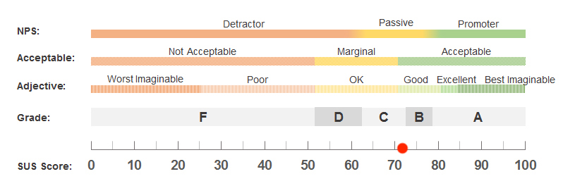
Chewy's system usability score, or SUS. They did all right.
DESIGN
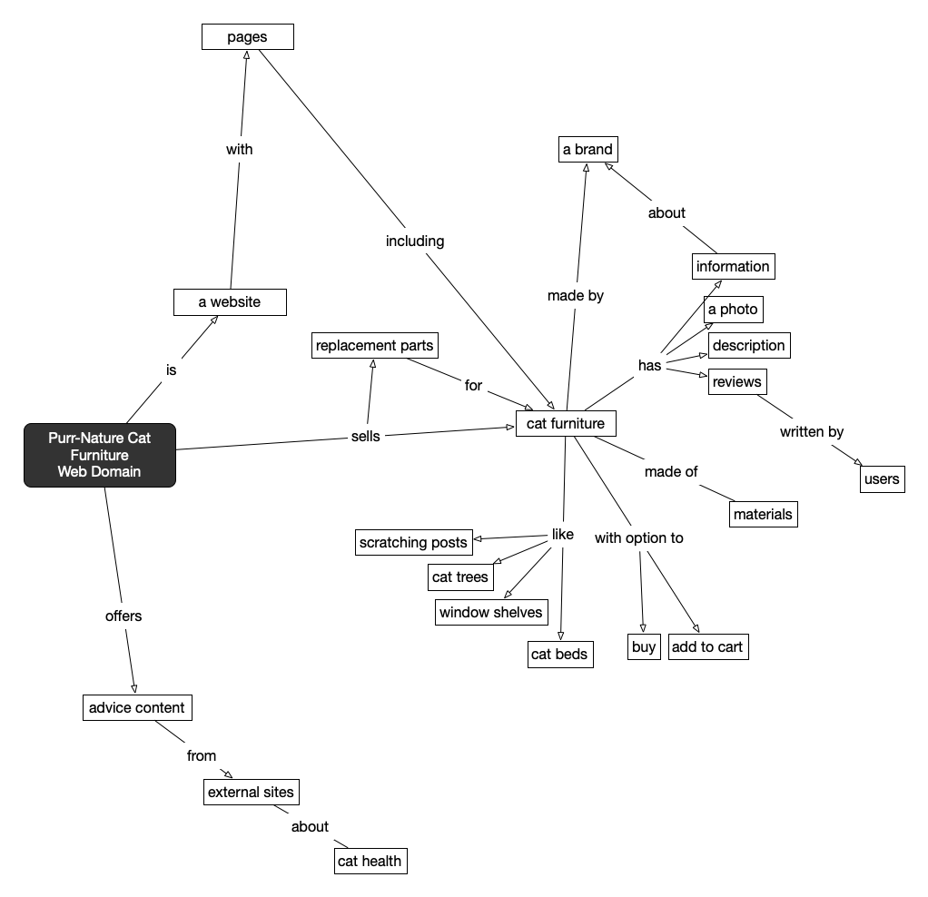
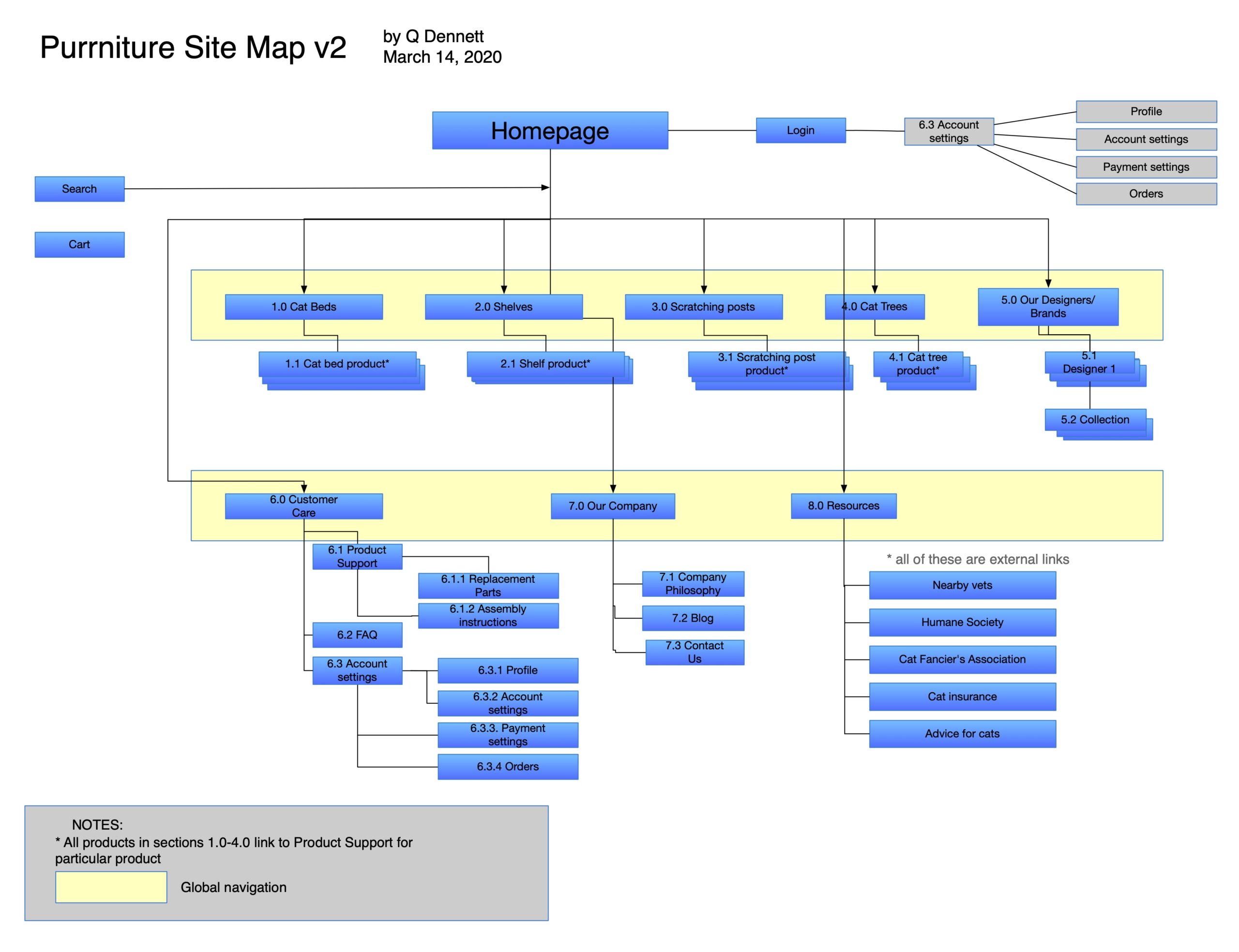
To get thoughts on paper, I started with a web domain of how all the elements I envisioned were related.
Afterward I mapped out domain site elements, which I then transferred to the wireframe iterations. Because data had indicated people did buy cat furniture on Amazon, I considered them my direct competitor. I drew inspiration from Amazon's navigational model, because users are familiar with it.
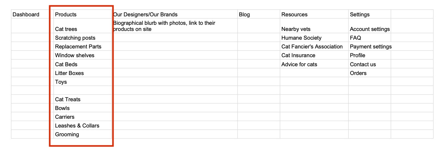
My first iterations of the domain map and wireframes used a common e-commerce pattern with products under high-level navigational group, “Products.” These iterations were quickly scrapped, because there was a disconnect between the company goals and user needs. Most e-commerce sites feature tons of products that crowd screen space, and need an agile navigation system to let users quickly move from section to section. Purrniture, being a luxury brand, did not have need of such a robust sytem for only a handful of products.
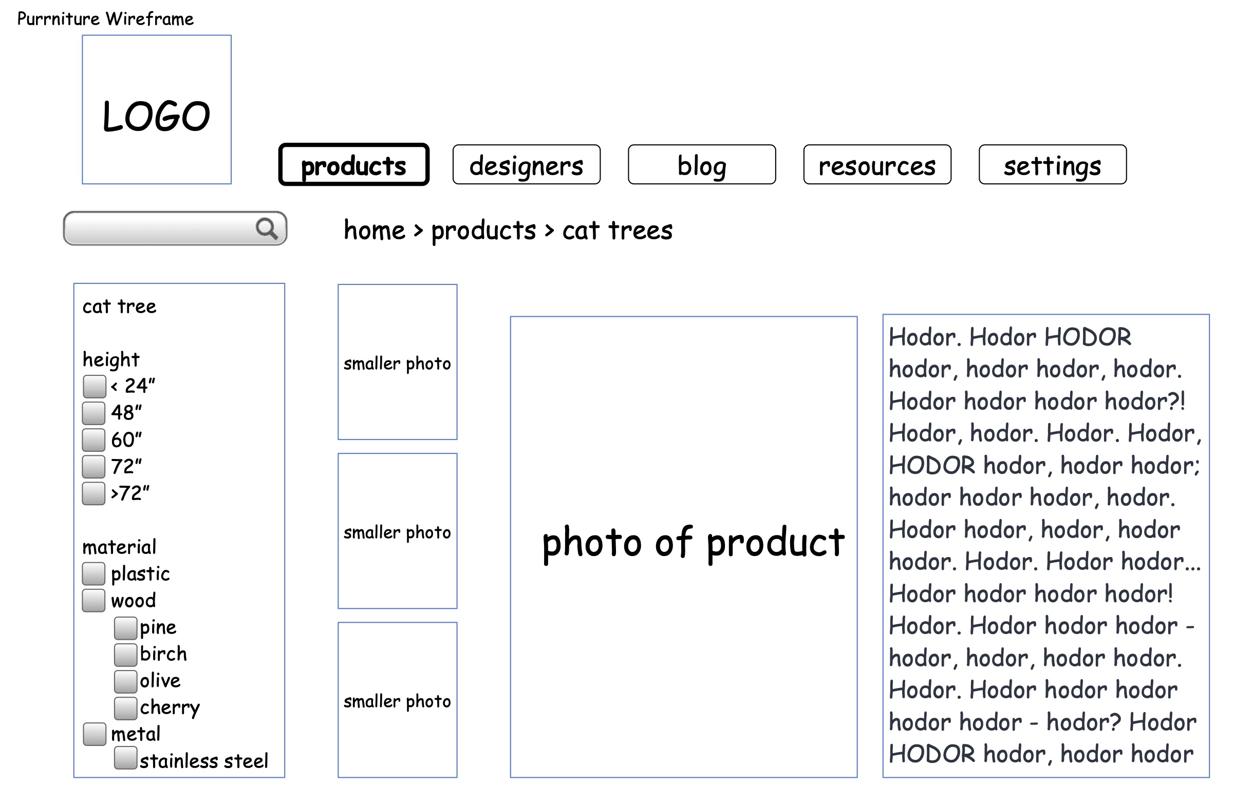
First wireframe of product page.
Design Pivot
I put the initial wireframes aside and went back to researching luxury brand websites.
There were no luxury cat furniture brands in North America to get inspiration from, so I sought out other luxury, non-pet product websites, like electronics, cars, and jewelry, that handle a low inventory. The sites I looked at overwhelmingly featured a simplified navigation system, pared-down sleek design, and large, high-res hero images. On every screen images had the highest hierarchy, followed by product name, and price (if it was included at all).
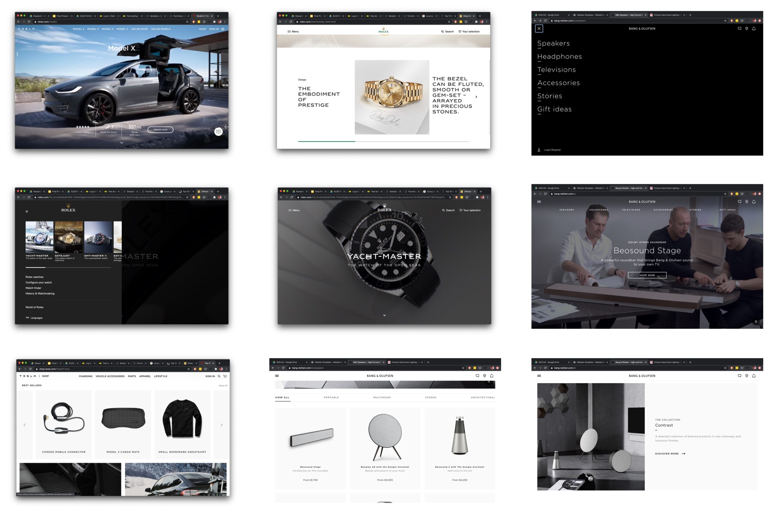
Some of the Purrniture inspiration included Rolex, Tesla, and Bang & Olufsen
Final iteration of site navigation.
Even though I shifted my design toward one inspired by common luxury site patterns, some first iterations elements remained. Research had indicated how much people liked and trusted Amazon's product reviews, so I incorporated a similar function in to Purrniture's design. My domain analyses didn't return a lot of sites with product reviews. Those that did feature reviews didn't usually include a rating metric, such as "4 stars out of 5 stars."
The site domain elements and navigation shifted. Most notable was moving all the cat furniture out of a generic “Products” category, and giving each category their own space in the main navigation bar. There was also a section to look at furniture by designer, and furniture by collection.
Mobile Design
Starting with a mobile-first design, my goals were the following:
- Image as hero above the fold. Customers were spending a lot of money on a product, and being able to inspect the item in high-res would increase buyer confidence.
- All product categories available from global navigation and on home as cards. With little room on a mobile screen, the images featured on the cards would function as marketing, as well as give people communicate the types of products they could find in that category.
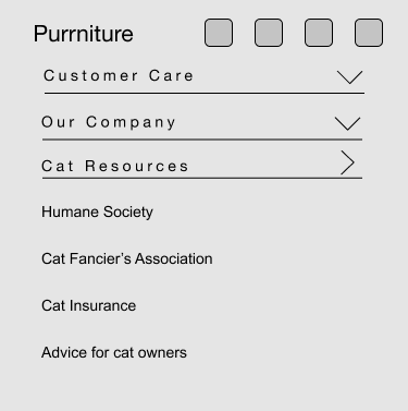
- Main navigation, user profile link, and a search bar available as an overlay, accessible by a “hamburger” icon, so that users wouldn’t have to go very far to find links and information they needed.
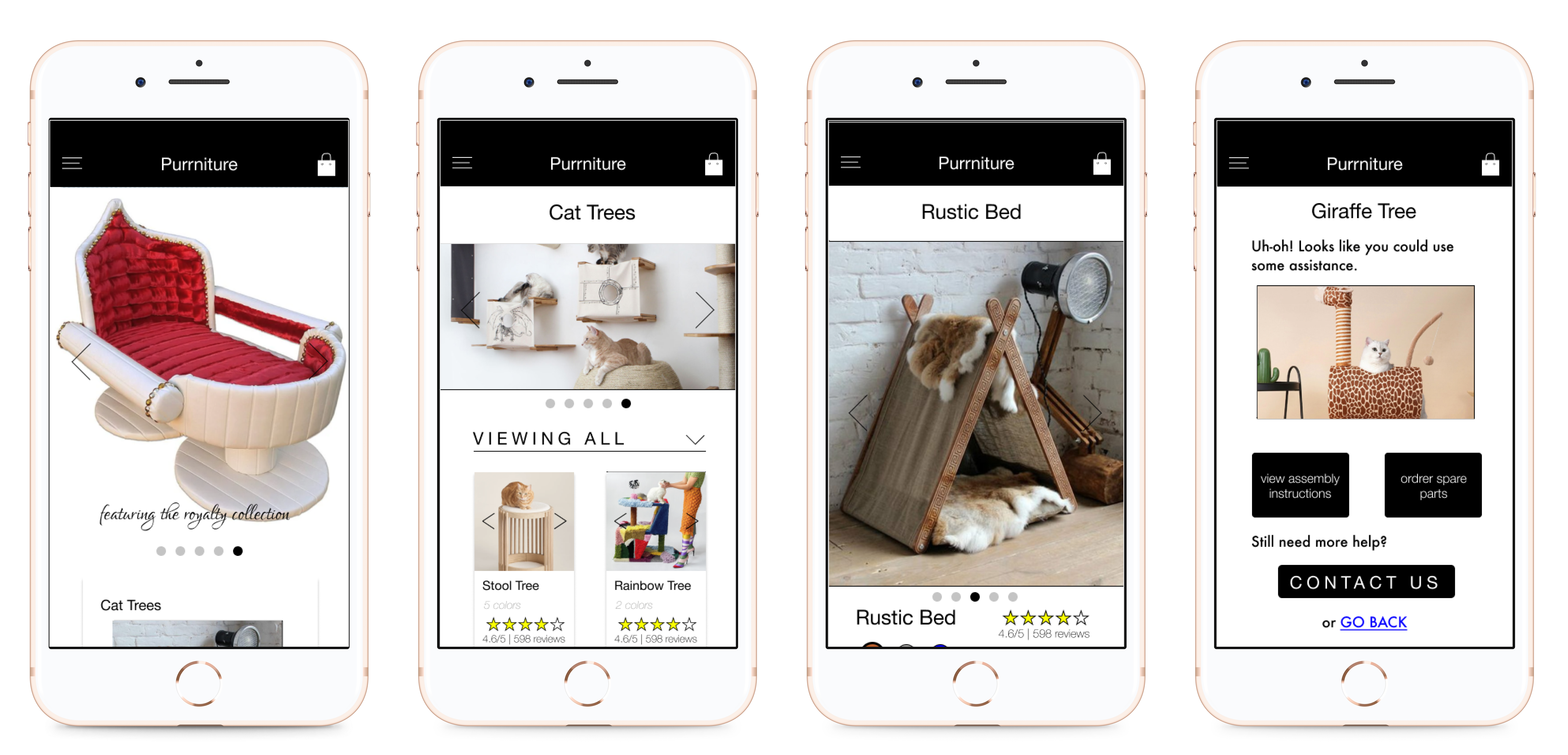
I created four screens for this design: a home page, category page, product page, and support page. In addition, I created the mobile navigation overlay, and footer menu.
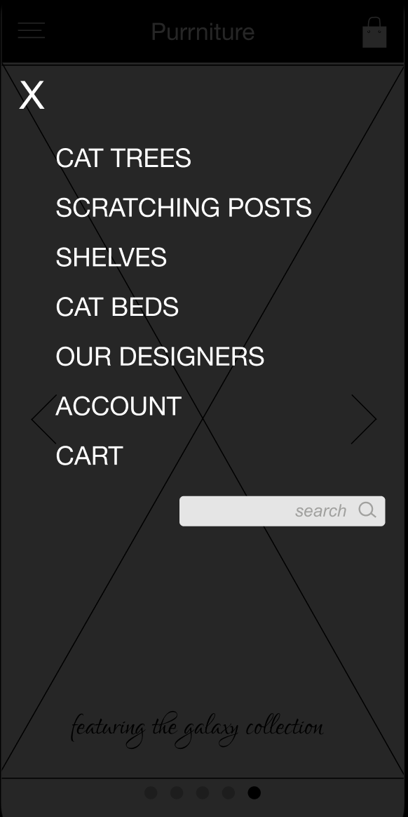
Mobile navigation overlay available through the "hamburger" menu.
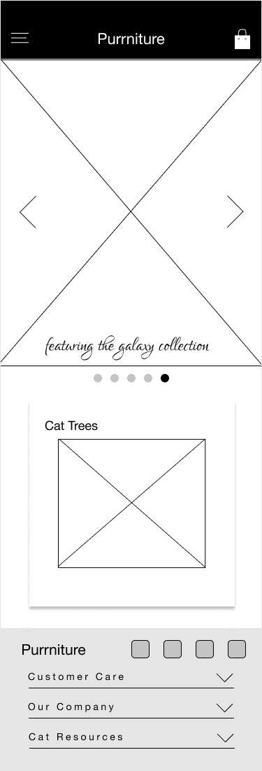
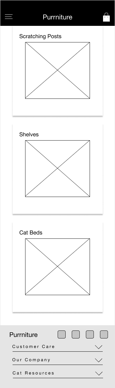
HOME PAGE
The home page starts with a large image carousel, and below that all the available product categories, as well as links to editorial marketing content, featuring a rotating selection of products. The large hero image above product options is a pretty standard design pattern in more luxury sites.
Though the user can scroll down to view the card content below the hero image, I don’t offer visual cues to this, for two reasons:
- All of those product categories are available through the navigational menu
- The hero image should not be interrupted, to highlight the product’s visual appeal
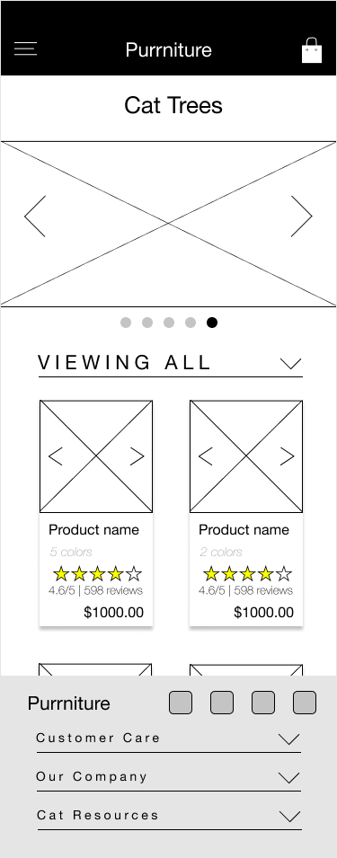
CATEGORY PAGE
The category page features an image carousel with rotating pictures in that category. Below that the available products are featured on clickable cards.
Each card has an image carousel, product name, price, and number of available colors, to give very basic, high-level information about the product for sale.
Because interviewees had indicated reading reviews gave them purchasing confidence, I also added each product’s average review and number of reviews on the cards.
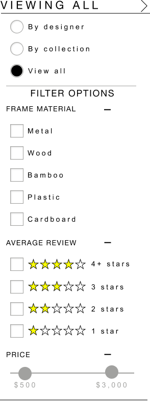
Detail of the filter and sort options.
The add-to-cart button, price, selected color, and item name are a sticky component with scrolling.
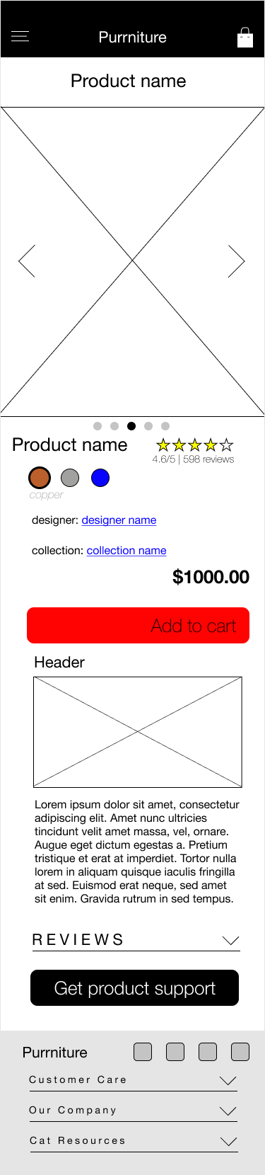
PRODUCT PAGE
Again the image is given the most importance here, with product name and average review above the fold, so users don’t have to scroll for that information.
Reviews are a collapsible accordion fold to save screen space, so they are there if the user wants to read them.
Each product has a link to the designer, collection, and product support, because our user will want to know where materials were sourced, and have some idea of item construction.
To make the purchasing experience more convenient, when the user scrolls down, there is a sticky component with the product name, color, price, and “add to cart.”
There is editorial content below all of the product information.
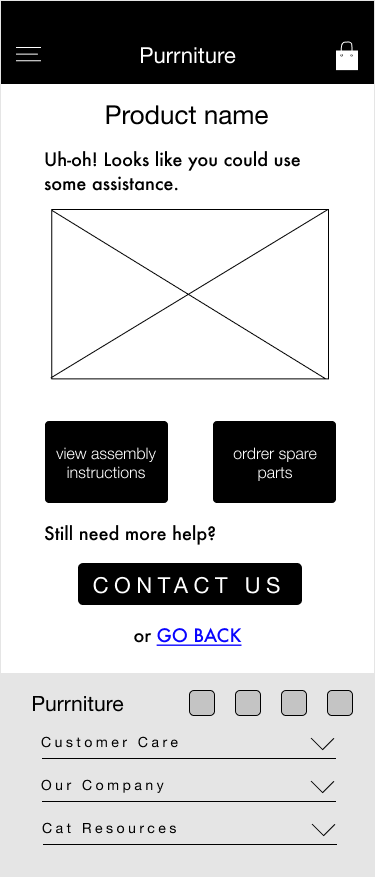
SUPPORT PAGE
The main goal for the support page was to give users all the support they needed without having to scroll for it. If they needed help, links to call, email, support articles, etc., should be the first thing they see.
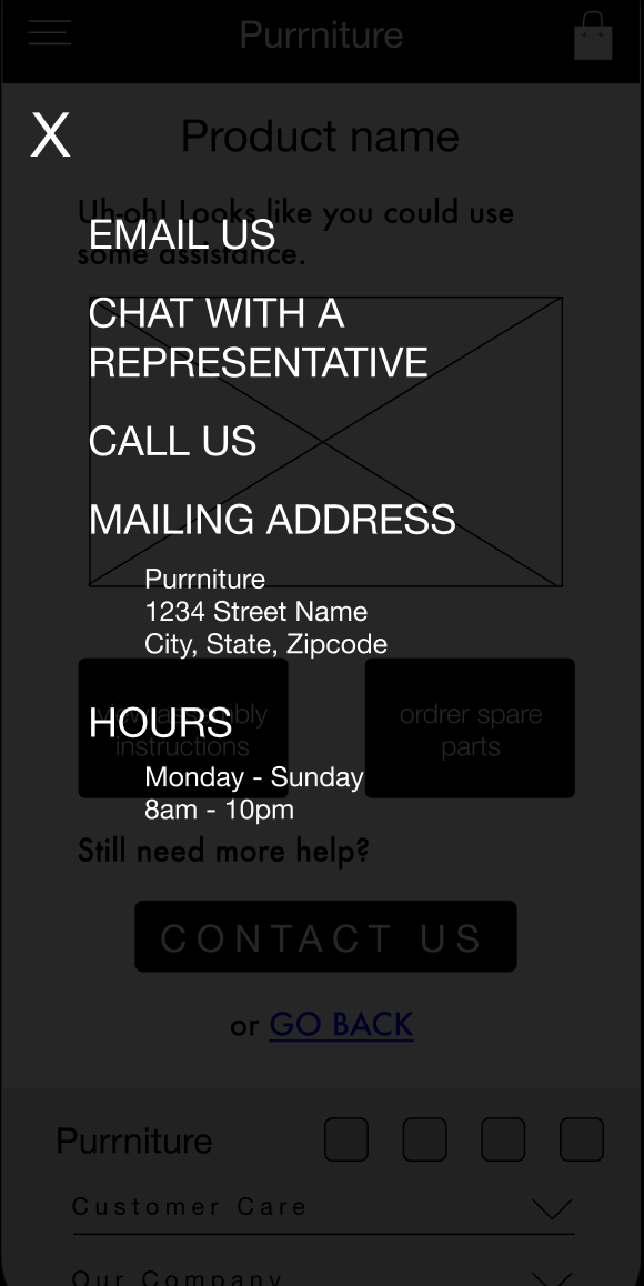
Overlay for Contact Us button.
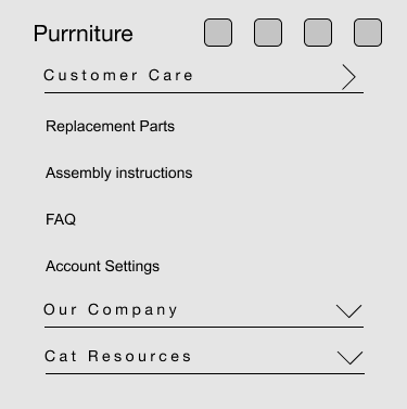
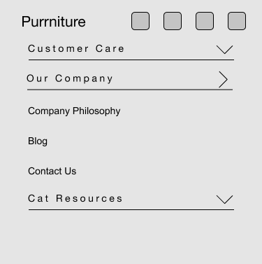
The footer menu features accordian menu controls and social media buttons.
OUTCOME
IMPACT
This project was a passion/made-up project, so impact to the company wasn't measurable. With more time, I could have done usability sessions with users on a rough prototype to see what the experience was versus Chewy, a competitor.
POST PORTEM
LESSONS LEARNED
First and foremost? Consider the companies goals right away, don't hop right into competitors and users. Purrniture’s goals and image didn’t align with most e-commerce sites.
Imagery impacts a site’s credibility, so I need to be intentional about not only how it’s used, but also how users receive it.
Just because a number of interviewees say they don’t care about how their furniture looks, doesn’t mean I change my design. It means they’re probably not my target users.
WHERE NOW?
Desktop design for Purrniture
With so much more screen to work with, the focus was on making the images as big as possible, while also keeping the sleek access in the mobile design. Navigational components, profile icon, and the search bar moved out from a menu overlay to a top header. Lesser-used, but still important items went into the footer.
The most notable changes from the mobile design were the following:
- On each category page, users can preview a product’s different color choices through the image carousel, without entering that product’s page
- The product page has more room for editorial content, such as separate stories about the collection or designer
- Product support has an option to view the assembly pdf file within the browser, or download it for future use.
There is a more in-depth, separate case-study coming soon for this. The link will be posted here when available.
Selected Works
PurrnitureMobile UX Design
Orca Business AccountsUX Design

in progress: TEACH.orgUX Design
In progress: Record AppMobile UX App