context
ORCA is a transportation card system in the Puget Sound area of Washington state that functions like cash or a pass on ferries, busses, the light rail, monorail, street car, and trains. They offer Business Accounts for companies who want transit cards for their employees.
MY ROLE
UX writer
Information Architecture
Research
TOOLS
Paper
TreeJack
Whatfont
Sketch
DISCOVERY
THE PROBLEM
Business representatives who visit the site to purchase a Business Account have a difficult time discovering the relevant link, quickly finding the information they need, and recovering from errors.
Businesses need to quickly find the purchasing information for transit passes, so they can make decisions.
USERS
Since the product I was focused on was ORCA for businesses in the Puget Sound region, I took a look at who would do business with them. The Business Choice Account flow, which was my focus, was open to companies with 1+ employees, so I was at least looking at sole proprietors.
I did desktop research for companies that do business with ORCA card. While I couldn’t find a list of companies, the Washington Department of Transportation report, “The Small Business Transit Subsidy,” for the period November 2018-May 2019, indicates that 121 small businesses (defined as fewer than 100 employees) and non-profits participated in this program. A few of the participating businesses were mentioned in the report’s Employer Highlight section. Their industries were video production, an education non-profit, and a tech startup.
I narrowed down my users to business owners or other company representatives responsible for purchasing travel passes, which is, admittedly, a pretty broad range. Because I didn’t have access to users for this project, I made assumptions about the user’s needs. Their needs were cost information, brevity, and scannability.
My past experience as a producer and business owner gave me a lot of empathy for how hectic a sole-proprietor’s typical work day is. Operating a business solo means responsibility for all business operations, like marketing and accounting, in addition to your actual business projects. Personally I would have considered looking at transportation options as extra work, and I may have skipped it if the experience was too difficult.
Regardless of who was in charge of purchasing these cards, they would have to go through this process.
Heuristic Evaluation
I began by doing a heuristic evaluation of the site, starting on the homepage and going through the Business Choice Account flow. The heuristics that needed work were findability, accessibility, error recovery, consistency, desirability, and scannability.
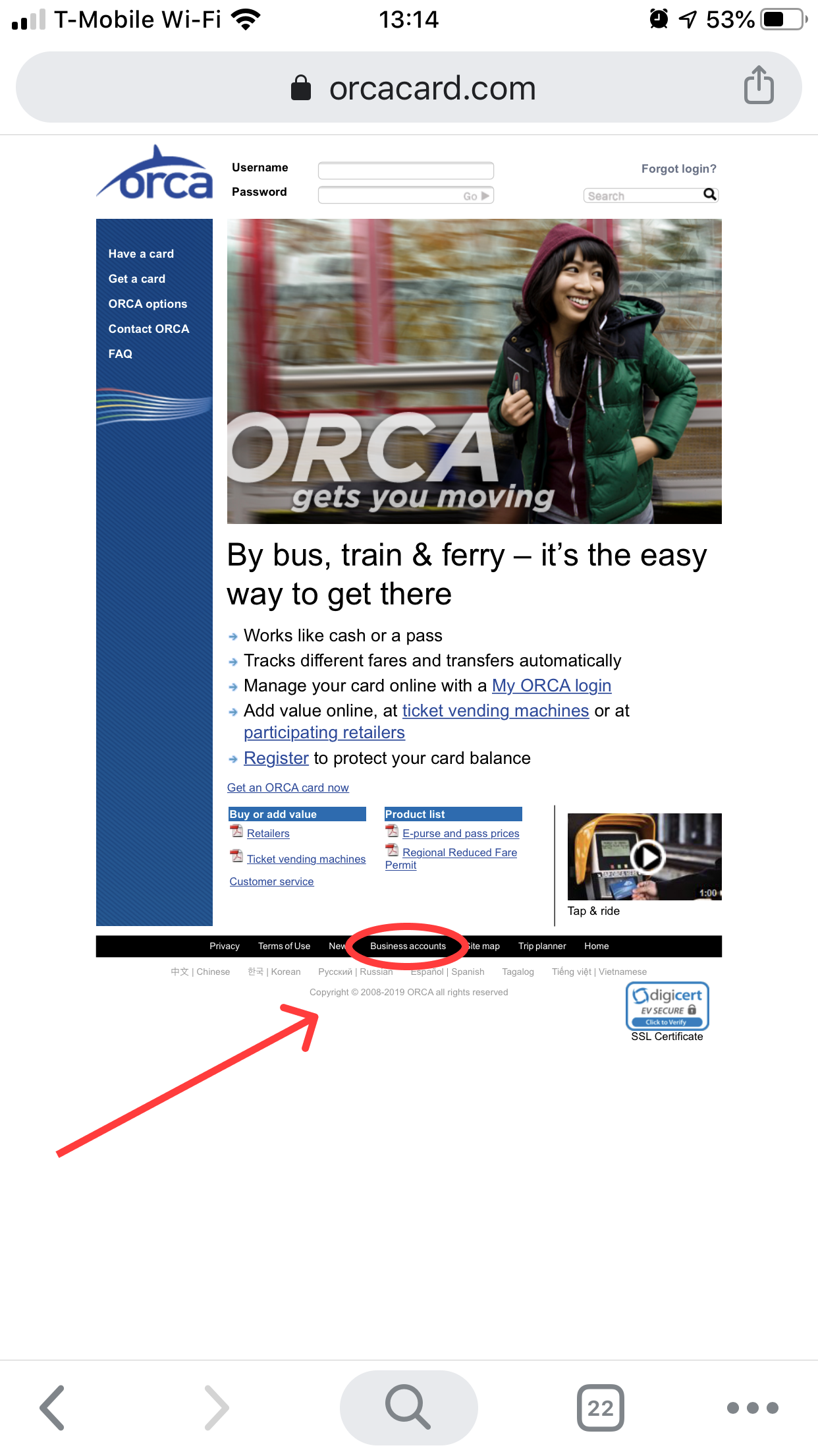
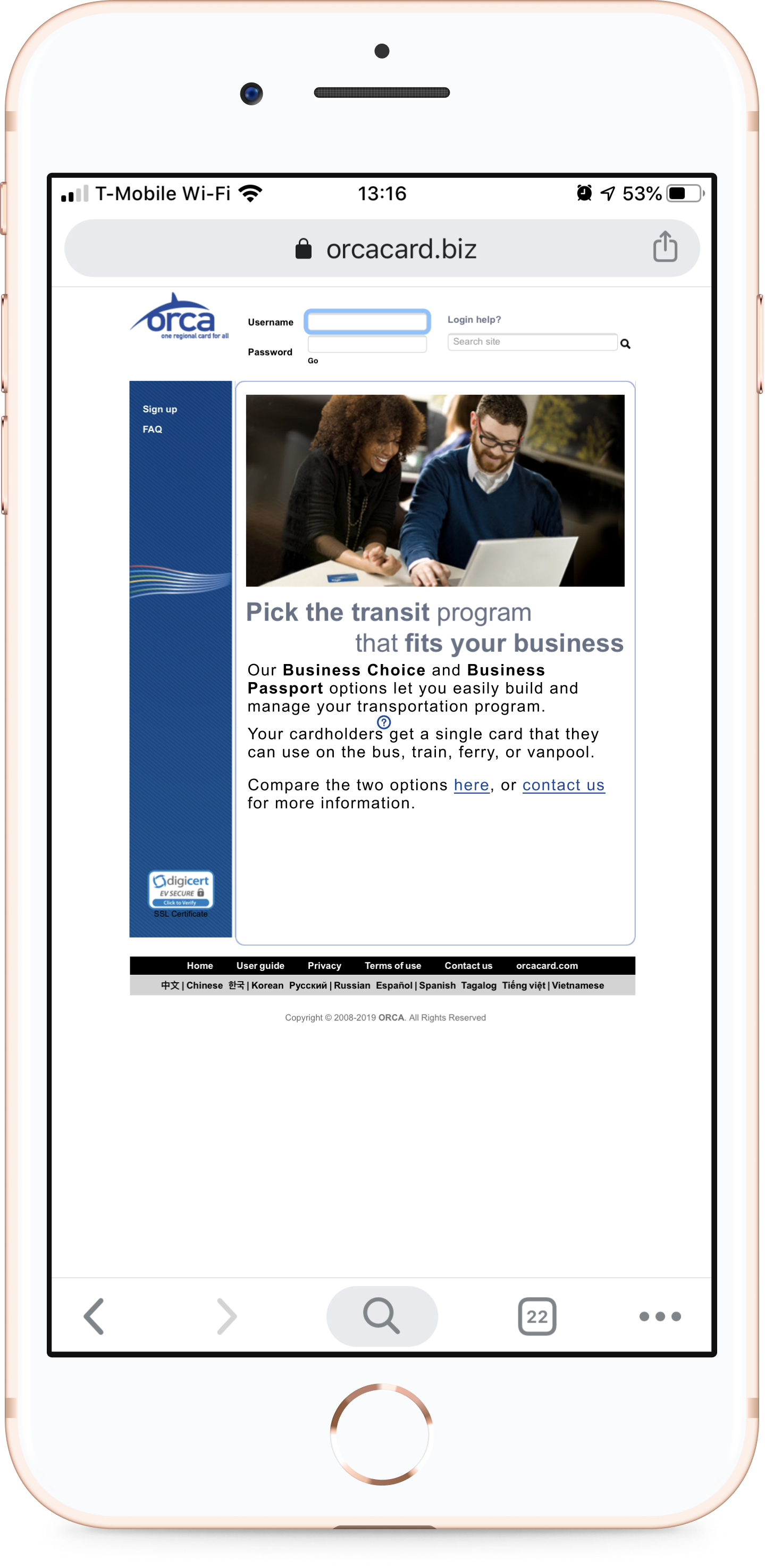
The business accounts were really hard to find.
FINDABILITY
First, I had to find the Business Account section from the home page, but it was not under any of the main navigation links. In order to find it I had to do a page search, and found it buried in the site footer.
ACCESSIBILITY & ERROR RECOVERY
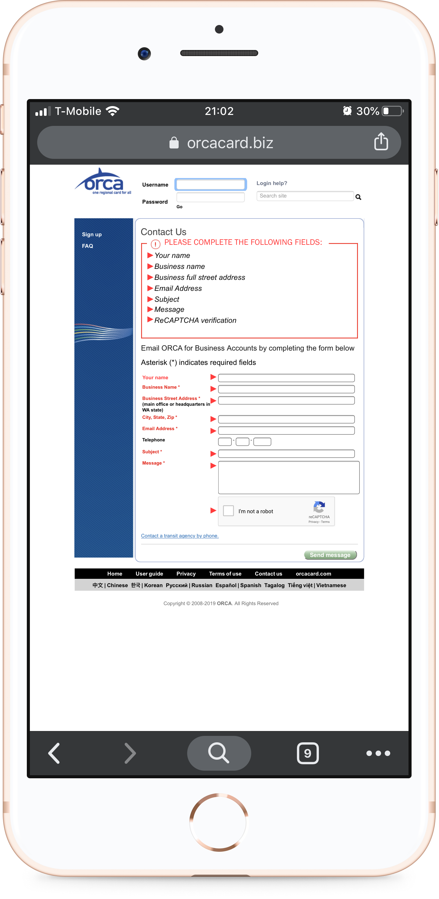
When I purposefully input the wrong information or missed fields, the system generated a red text error message, which would have been inaccessible to someone with red-green color-blindness. The text said, “Correct the following errors,” listed out those field names, then changed the corresponding field names to red. So it told me I’d made a mistake, told me everything that was wrong, but didn’t help me locate the fields.
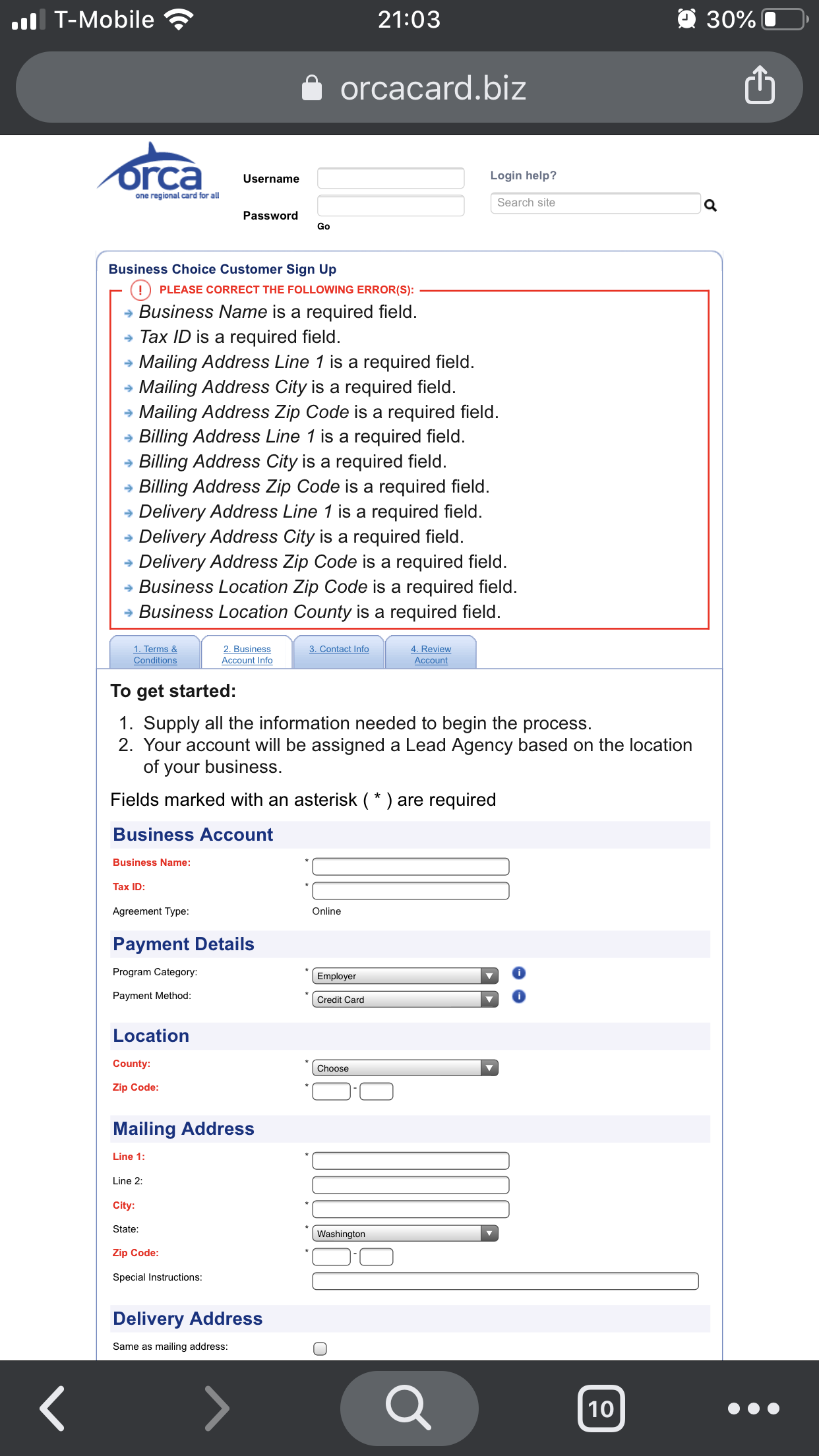
The error messages weren't helpful to people with red-green color-blindness.
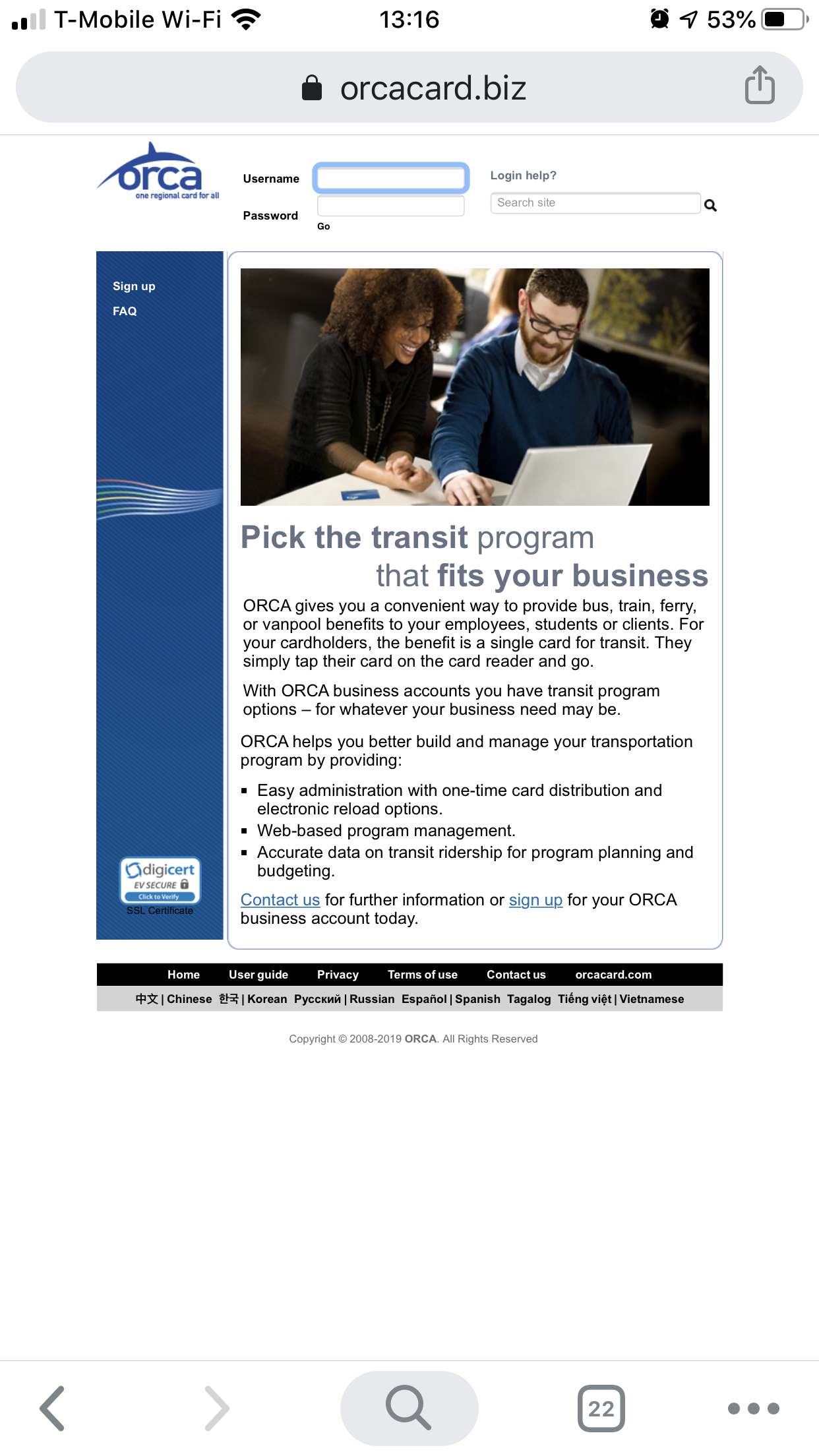
The "sign up" link doesn't go where it says.
CONSISTENCY
The link and button text, at times, didn’t match the destinations, which would cause user confusion. The Business Account entry page was topped with a header asking the user to pick the best option for their business, without explaining them, with a link to sign up. Clicking “sign up” didn’t take me to a sign up page, but instead to an information page.
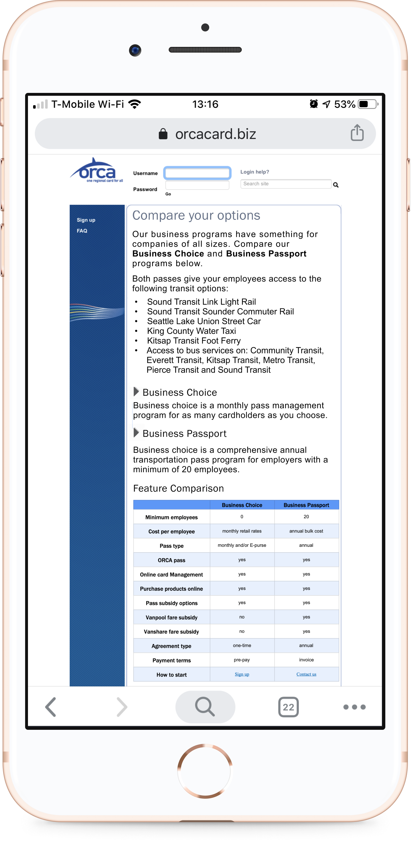
DESIRABILITY & SCANNABILITY
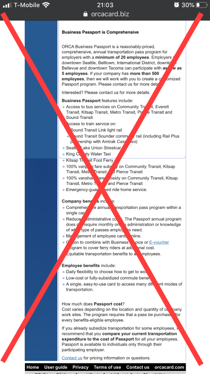
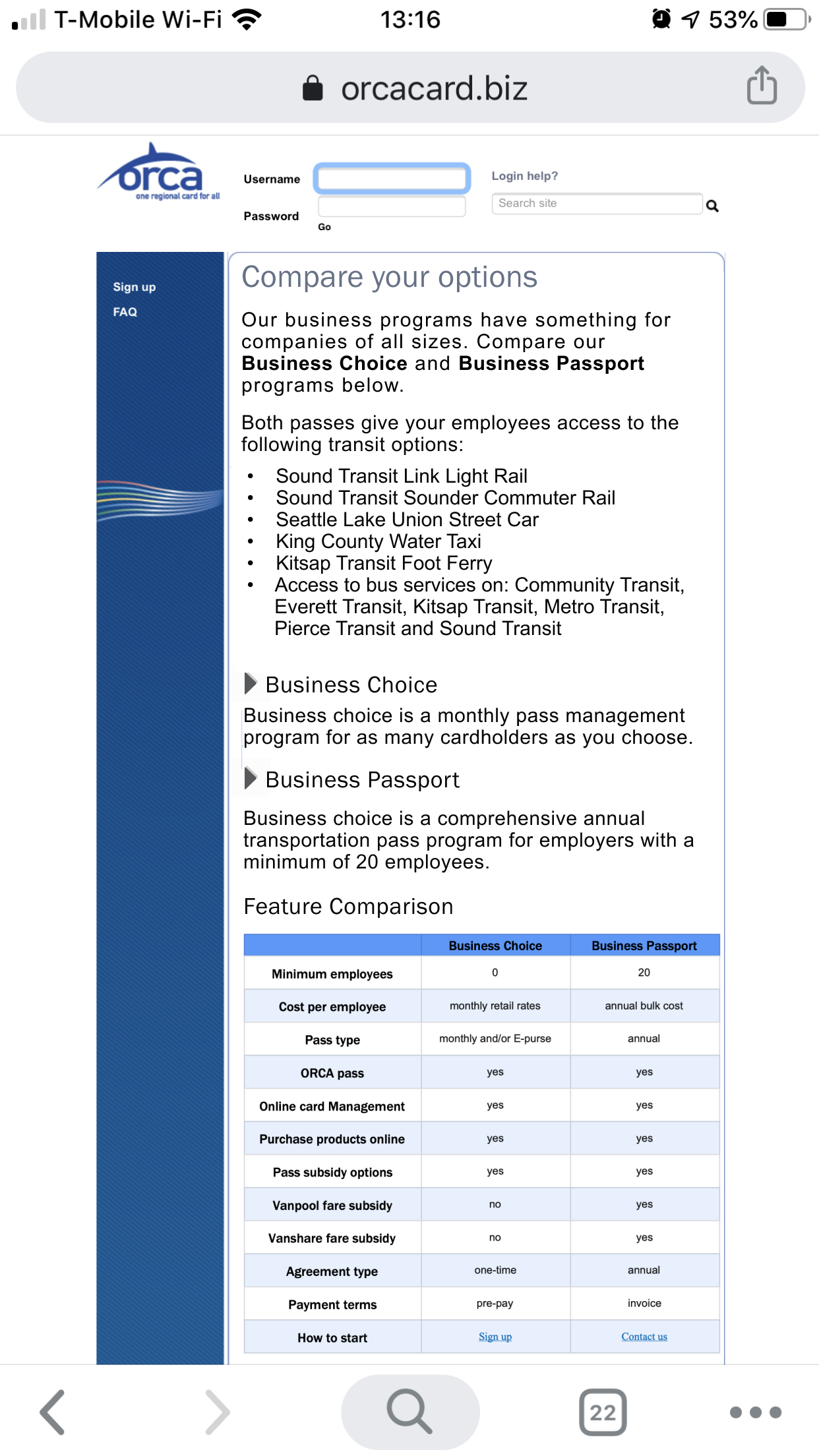
The Business Account landing page and the next information page were very text-heavy, and a lot of it seemed to be marketing, rather than informative. The text also lacked hierarchy to let users know what was important. There was a comparison table about the two choices, Business Passport and Business Choice, but it was also text-heavy, so scanning was impossible.
The Business Passport required calling a person to complete, while the Business Choice Account enrollment could be completed from the website over the course of four tabs:
- Terms & Conditions
- Business Account Info
- Contact Info
- Review Account
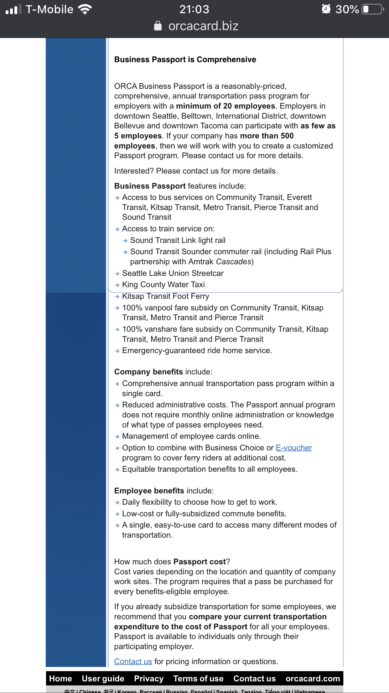
Oh, so much text! This is just one of 2 page-length scrolls.
Cost of these services wasn’t mentioned on any of these pages, which seemed like an important detail before entering payment information.
Goals
Based on my evaluation, I developed the following goals:
1
Increase discoverability of the business accounts
2
Improve usability of the site by paring down and simplifying the information and links
3
Give more informative error messages when the user needs guidance
PROCESS
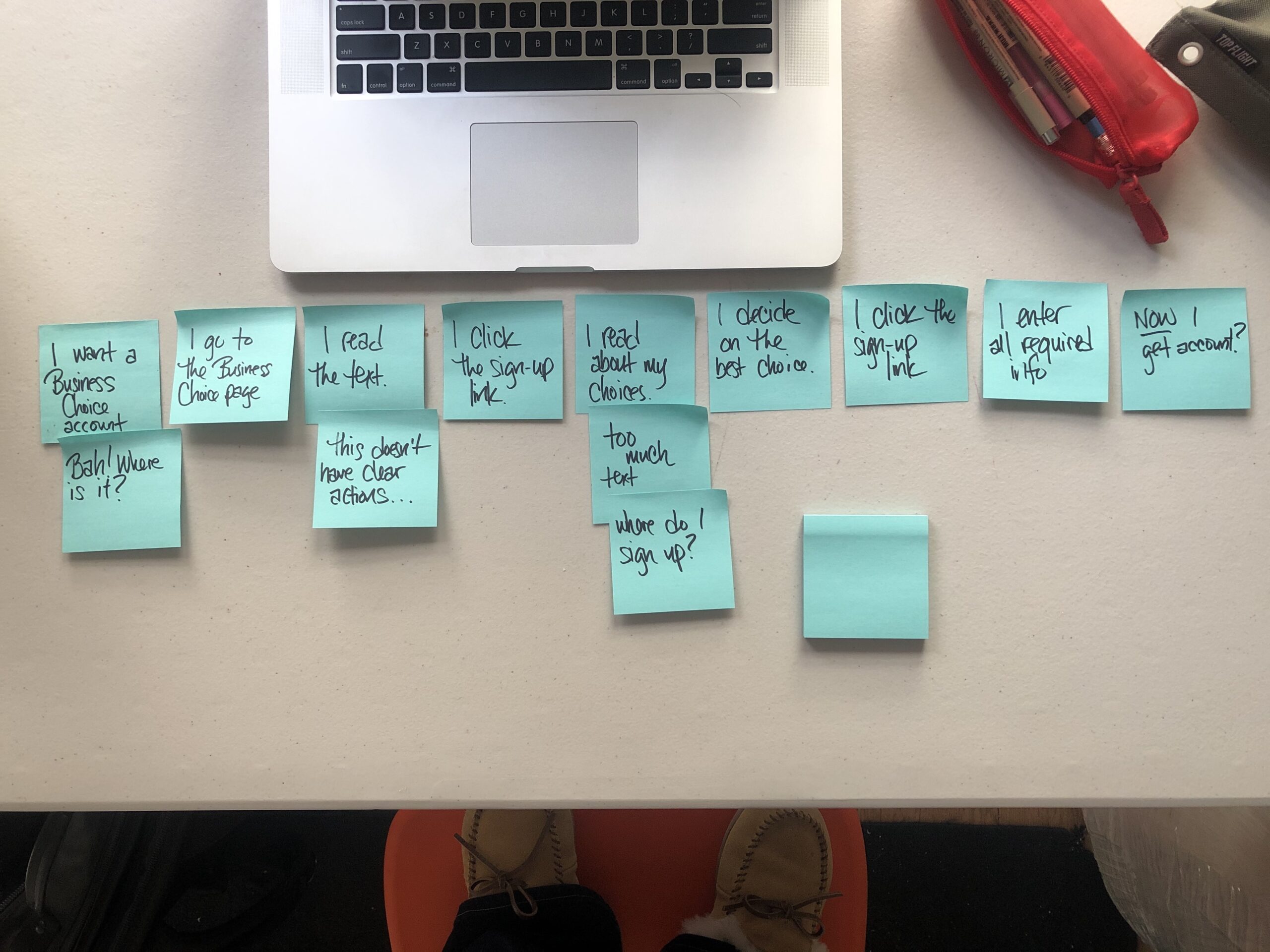
The original user journey.
To begin I mapped the current user journey to creating a business account from the home page, to see if the journey efficiently helped the user complete their goal:
- Decide to purchase a Business Account
- Go to Business Account page
- Read the text
- Click the sign-up link
- Read about choices
- Decide on the best choice
- Click the sign-up link
- Enter all required info
- Receive account activation
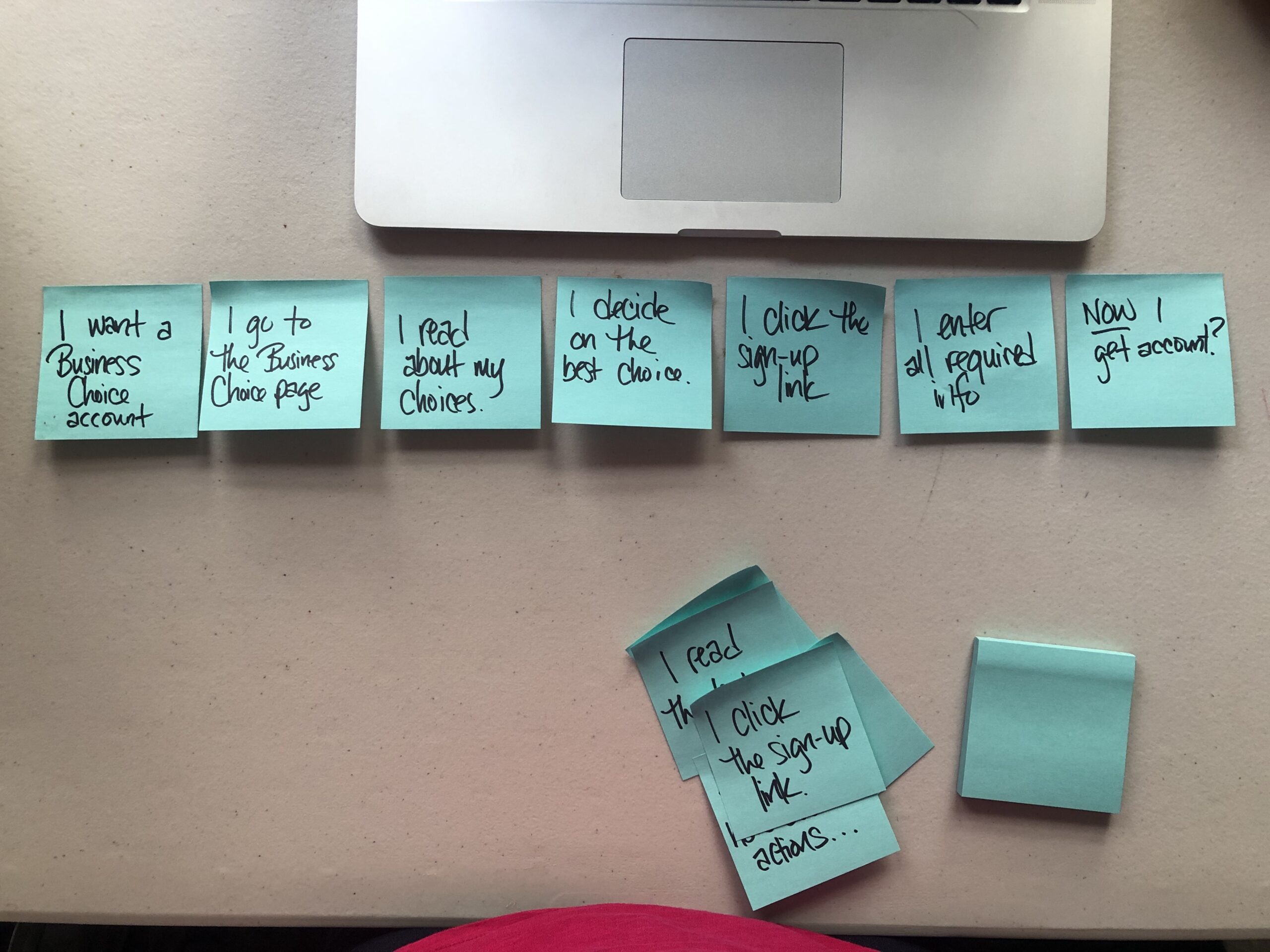
New, simplified user journey.
I imagined a new journey, by removing a repeat step, and simplifying to reduce cognitive load:
- Decide to purchase a Business Account
- Go to Business Account page
- Read about choices
- Decide on the best choice
- Click the sign-up link
- Enter all the required info
- Receive account activation
With this new flow in mind, I started tackling the goals I’d previously outlined.
INCREASE DISCOVERABILITY
To increase the discoverability of the business accounts, I pulled the link out of the footer and inserted it into the main navigation, the first place the user would look for it.
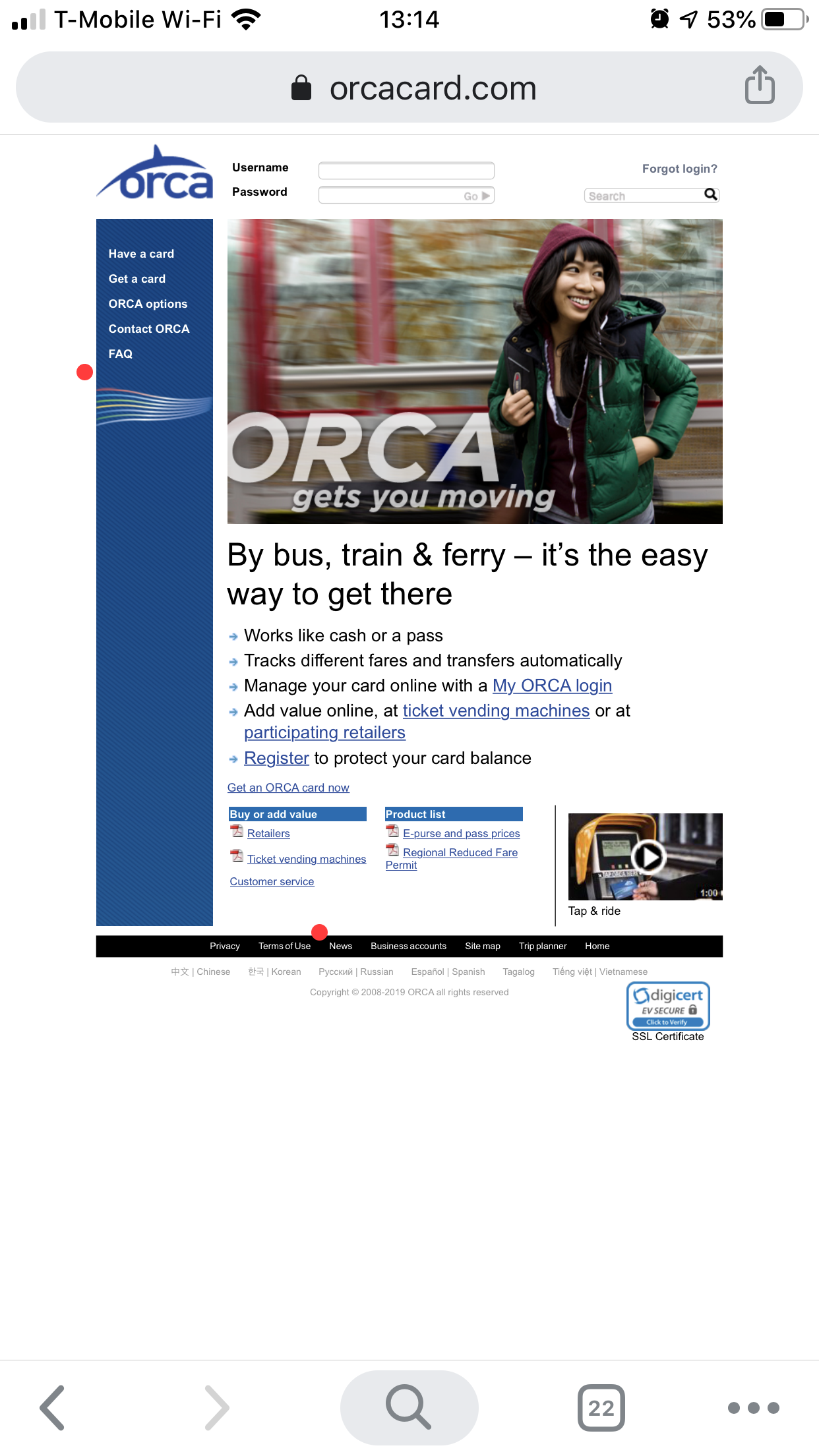
This is the old experience. Note the original footer and side navigation.
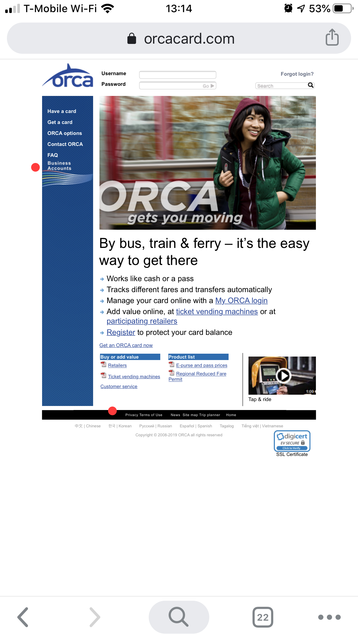
The new design.
IMPROVE USABILITY
The point of any text on the page was to give as much information as needed, to let busy professionals quickly make decisions. To achieve this I created a voice attribute chart to define the voice I wanted for communicating to users. I developed this chart after evaluating the voice used on the other, non-business portion of the site, and then adapting it to fit my assumed user needs of brevity and scannability.
This chart laid out voice principles, which content to emphasize and with how many words, what vocabulary or jargon was acceptable, and grammar. As a result of this chart, I decided the voice should be informative, reliable, caring without being too familiar, and polite.
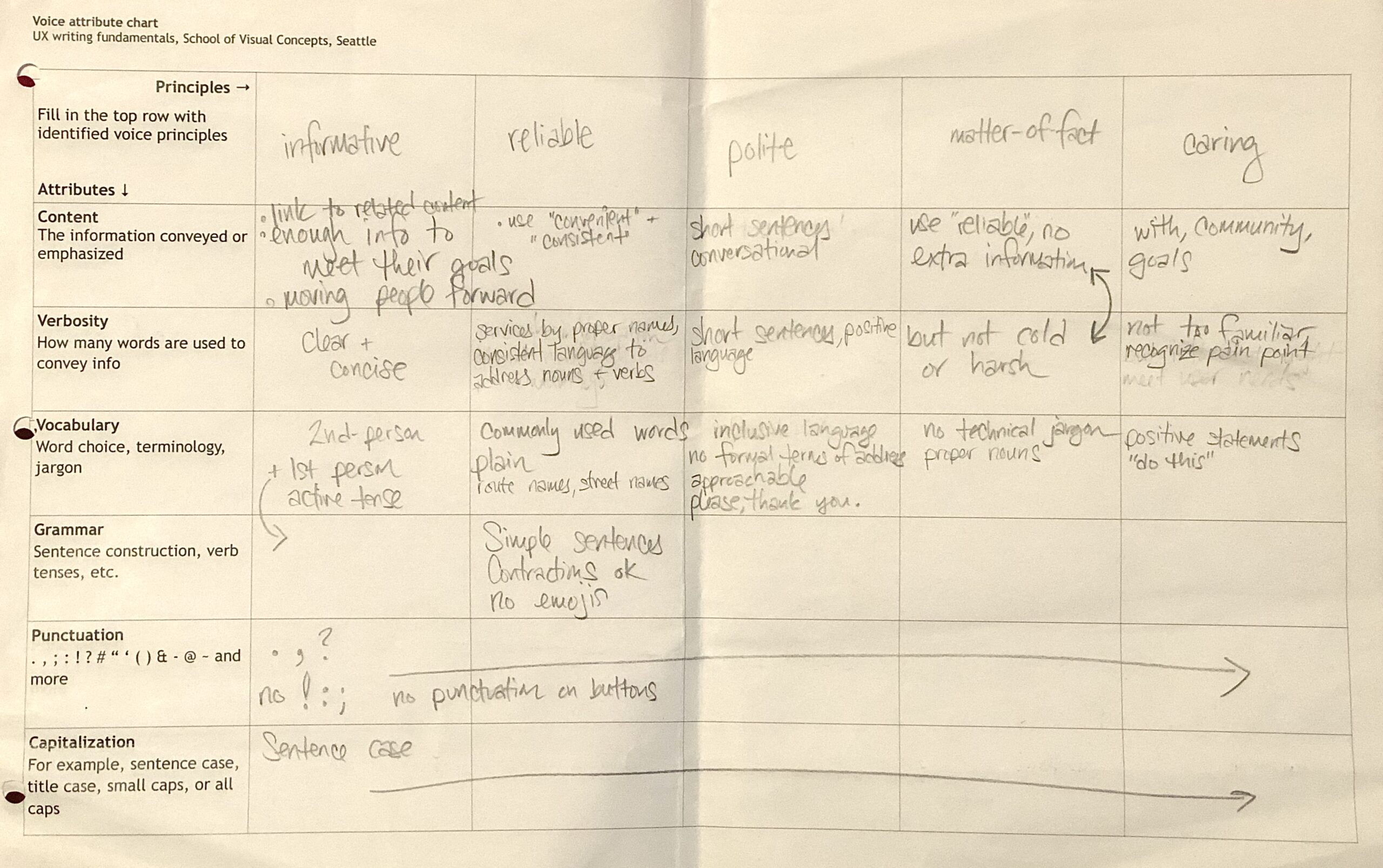
The Voice Attribute chart of Orca Business Accounts
I cut out about 1 full page of text.
A lot of the pages were text heavy, without a sense of information hierarchy. I went back through each page of the user flow and highlighted info they’d need to complete their task. Some of the links text didn’t match with their destinations, so I also updated those to be more informative and accurate. Left with just the necessary text, I then started adding personality back with the voice attributes I’d defined earlier.
The Business Passport vs. Business Choice Account comparison chart’s categories and key points were hard to find. To reduce the bulk of the earlier paragraphs, I moved some information, such as whether passes could be purchased online, to the chart, created new categories, and simplified text to increase the user’s ability to scan quickly.
The original design.
The two available options are called out, "cardholders" definition is hidden behind an info bubble, and links are updated to be more accurate.
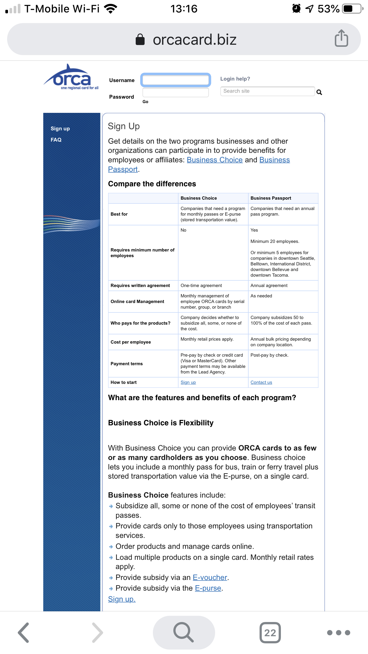
This original table was difficult to scan for key info.
The two difference account types are compared more clearly.
ERROR MESSAGES & ACCESSIBILITY
The error messages were harsh and “blame-y”, without offering help to fix the error, and the red text wasn’t accessible to people with color-blindness. I changed the language and added visual indicators to draw the eye, so that ORCA wasn’t relying solely on red text to communicate.
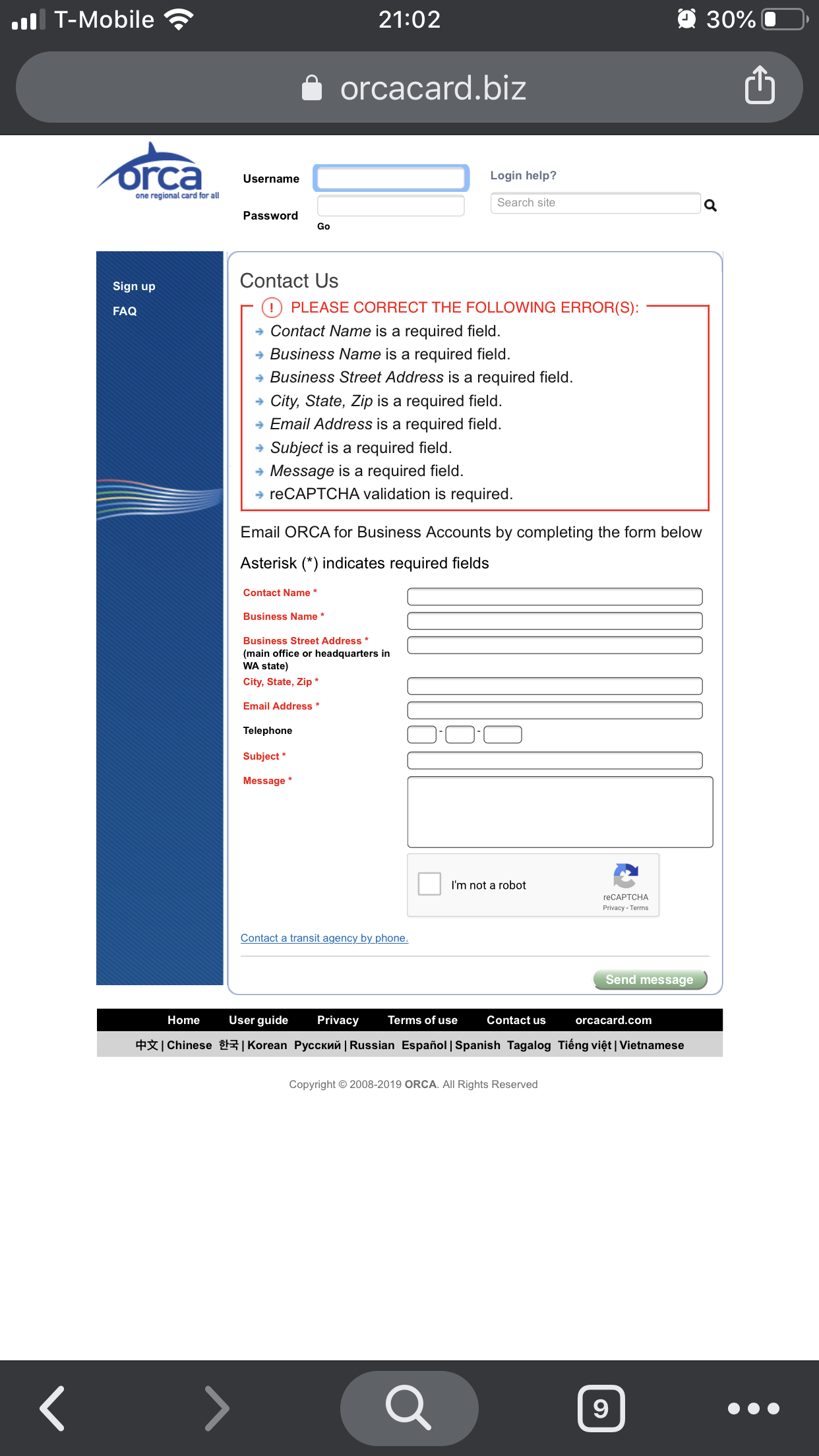
This error message is hard to understand and inaccessible for red-green colorblindness.
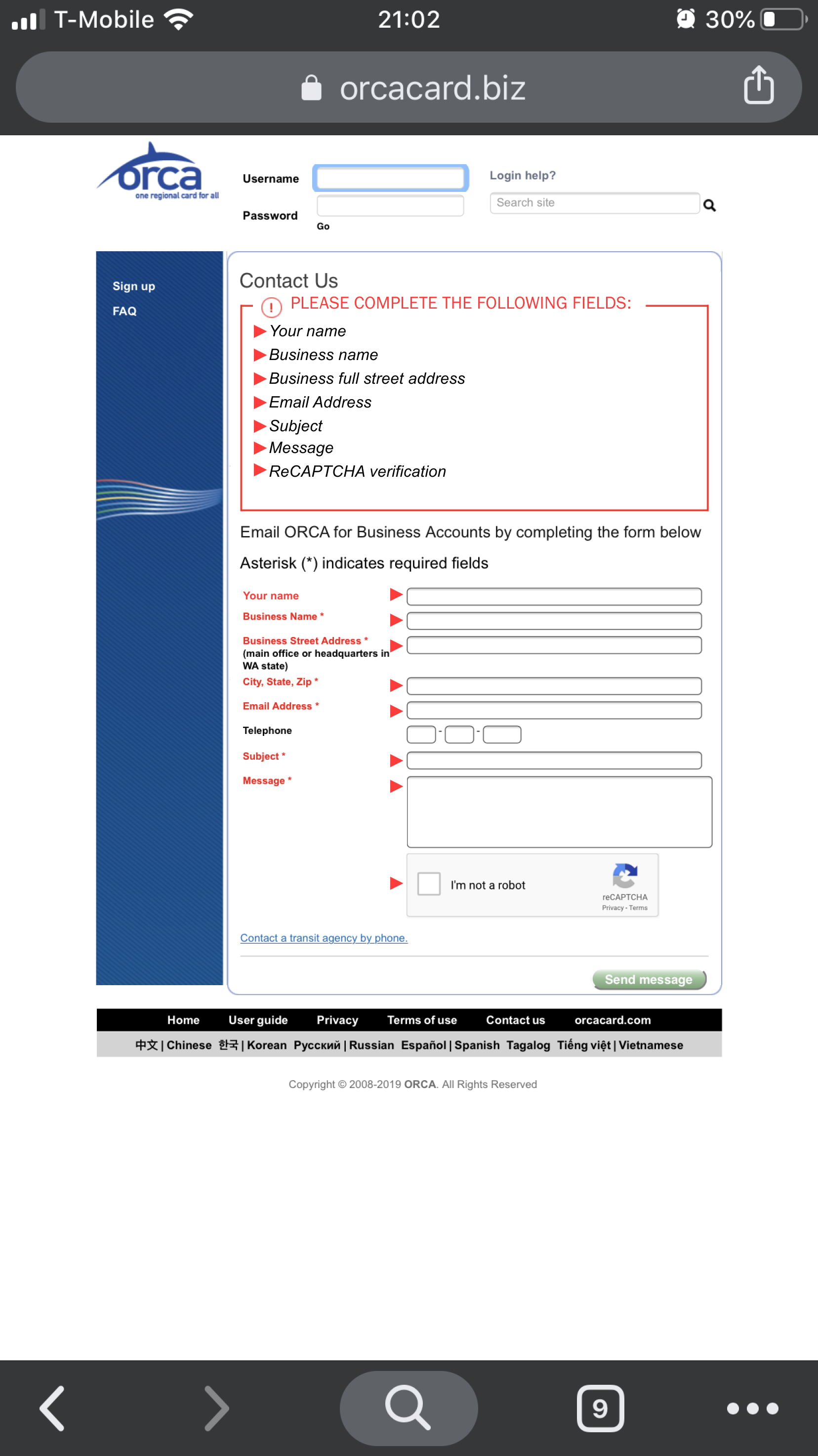
Visual elements added to be more accessible, and the language changed to be more positive.
WHAT WERE THE RESULTS?
Since this project was for a UX Writing class, I didn’t verify my impact. However, I’m in the process of setting up a usability test, using time-on-task and success rate as metrics. I’ll add those results here as soon as those are available.
POST MORTEM
LESSONS LEARNED
I began defining the voice for ORCA Business by analyzing the non-professional portion of the site, and then editing some principles to be more professional. Since a lot of companies have multiple users, knowing how to talk to all of them with consistency will come in handy.
Writing has as much an impact on the experience as navigation and interaction. Keeping the original text, and just updating the information architecture would have only minimally improved the site usability for users.
For this project I learned how to markup an experience, using opaque white boxes to cover up text in the existing page, and use the company’s fonts to write what I wanted. This is a quick, easy way to communicate with the client, and rapidly iterate and prototype.
WHAT'S NEXT?
For this project, I focused on the mobile experience. Going forward, I would design a desktop experience, to maximize coverage of users.
In the existing flow I only went as far as the Business Account Info tab, but I put in place a voice system that can be carried through into the end of the flow and any other Business Account pages for ORCA.
Selected Works
PurrnitureMobile UX Design
Orca Business AccountsUX Design
in progress: TEACH.orgUX Design
In progress: Record AppMobile UX App